08 · Explorative Datenanalyse und Datenvisualisierung
streu_crp_verweildauer.png
Abbildung · Quellcode
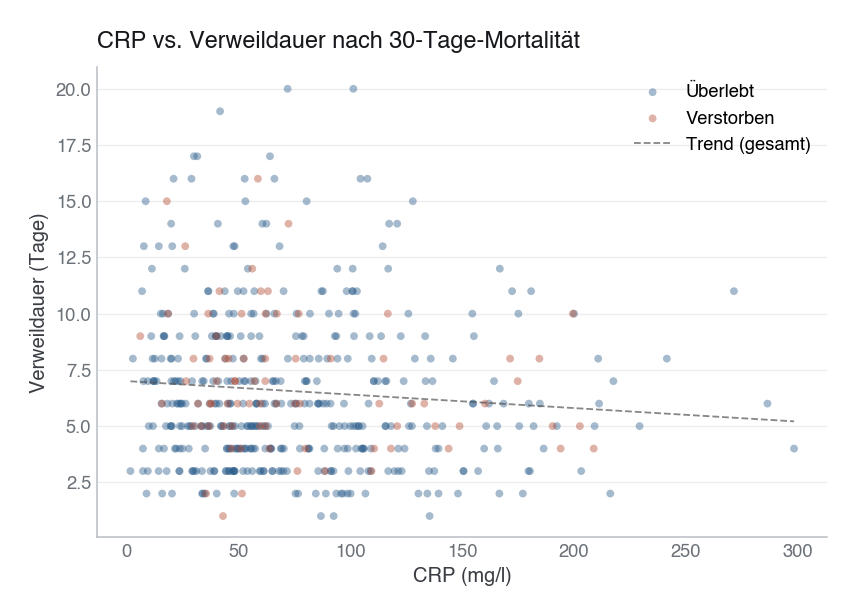
Erzeugt im Abschnitt „streu_crp_verweildauer" in data/figures.py, Zeile 202–229.
Dieses Skript läuft von oben nach unten. Der gemeinsame Vorspann — Bibliotheken, Kohorte laden, Plot-Stil — steht am Anfang der vollständigen Datei und gilt für alle Abbildungen darin.
Python
Python-Code: in eine Datei mit Endung
.py schreiben und mit dem ▶-Knopf in VS Code ausführen – oder Zeile für Zeile in die Python-Konsole. Setzt die in Modul 02 eingerichtete Umgebung voraus.# --- 07c: CRP vs. length of stay (scatter, coloured by outcome) --- fig, ax = plt.subplots(figsize=(7, 5)) for outcome_val, label, color, marker in [ (0, "Überlebt", PRIMARY, "o"), (1, "Verstorben", EVENT, "X"), ]: sub = df[df["verstorben_30d"] == outcome_val] ax.scatter(sub["crp_mg_l"], sub["verweildauer_tage"], c=color, label=label, alpha=0.42, s=22, edgecolors="none", marker=marker) ax.set_xlabel("CRP (mg/l)") ax.set_ylabel("Verweildauer (Tage)") ax.set_title("CRP vs. Verweildauer nach 30-Tage-Mortalität") ax.legend(title=None) # Overall trend line mask = df["crp_mg_l"].notna() & df["verweildauer_tage"].notna() x_all = df.loc[mask, "crp_mg_l"].values y_all = df.loc[mask, "verweildauer_tage"].values z = np.polyfit(x_all, y_all, 1) x_range = np.linspace(x_all.min(), x_all.max(), 200) ax.plot(x_range, np.poly1d(z)(x_range), color=SECONDARY, linewidth=1.1, linestyle="--", alpha=0.7, label="Trend (gesamt)") ax.legend(title=None) save(fig, ASSETS / "08-eda-visualisierung" / "assets" / "streu_crp_verweildauer.png")