10 · Inferenzstatistik und Hypothesentests
laktat_sepsis_vergleich.png
Abbildung · Quellcode
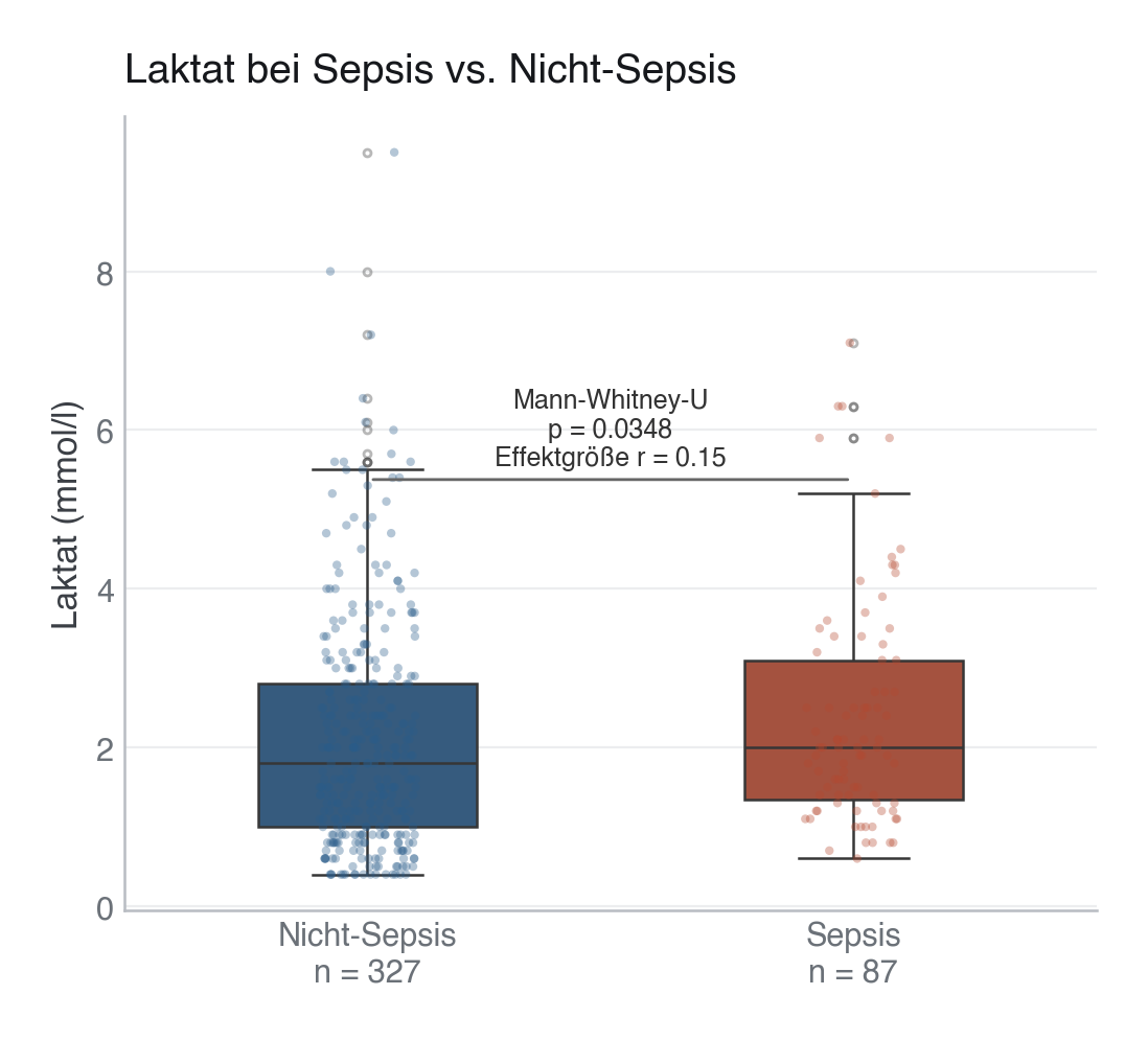
Erzeugt im Abschnitt „MODULE 10 · Lactate: Sepsis vs. Nicht-Sepsis" in data/figures.py, Zeile 331–386.
Dieses Skript läuft von oben nach unten. Der gemeinsame Vorspann — Bibliotheken, Kohorte laden, Plot-Stil — steht am Anfang der vollständigen Datei und gilt für alle Abbildungen darin.
Python
Python-Code: in eine Datei mit Endung
.py schreiben und mit dem ▶-Knopf in VS Code ausführen – oder Zeile für Zeile in die Python-Konsole. Setzt die in Modul 02 eingerichtete Umgebung voraus.# =========================================================================== # MODULE 10 · Lactate: Sepsis vs. Nicht-Sepsis # =========================================================================== print("[10] Laktat Sepsis-Vergleich ...") df_sep = df.dropna(subset=["laktat_mmol_l"]).copy() sepsis_vals = df_sep.loc[df_sep["sepsis_gruppe"] == "Sepsis", "laktat_mmol_l"] non_sepsis_vals = df_sep.loc[df_sep["sepsis_gruppe"] == "Nicht-Sepsis", "laktat_mmol_l"] # Statistics _, p_val = stats.mannwhitneyu(sepsis_vals, non_sepsis_vals, alternative="two-sided") n1, n2 = len(sepsis_vals), len(non_sepsis_vals) u_stat, _ = stats.mannwhitneyu(sepsis_vals, non_sepsis_vals, alternative="two-sided") # Rank-biserial r as effect size r_effect = 2 * u_stat / (n1 * n2) - 1 fig, ax = plt.subplots(figsize=(6, 5)) palette_sep = {"Sepsis": EVENT, "Nicht-Sepsis": PRIMARY} order = ["Nicht-Sepsis", "Sepsis"] sns.boxplot( data=df_sep, x="sepsis_gruppe", y="laktat_mmol_l", hue="sepsis_gruppe", order=order, palette=palette_sep, width=0.45, linewidth=0.9, fliersize=2.5, flierprops=dict(marker="o", alpha=0.35), legend=False, ax=ax, ) sns.stripplot( data=df_sep, x="sepsis_gruppe", y="laktat_mmol_l", hue="sepsis_gruppe", order=order, palette=palette_sep, size=3, alpha=0.35, jitter=True, legend=False, ax=ax, ) ax.set_xlabel("") ax.set_ylabel("Laktat (mmol/l)") ax.set_title("Laktat bei Sepsis vs. Nicht-Sepsis") # Sample size as a second line in each category label (no overlap) ax.set_xticks(range(len(order))) ax.set_xticklabels([f"{g}\nn = {df_sep[df_sep['sepsis_gruppe'] == g].shape[0]}" for g in order]) # Significance annotation y_max = df_sep["laktat_mmol_l"].quantile(0.97) p_txt = f"p = {p_val:.4f}" if p_val >= 0.0001 else "p < 0.0001" ax.annotate( "", xy=(1, y_max * 0.96), xytext=(0, y_max * 0.96), arrowprops=dict(arrowstyle="-", color="#666666", lw=1.0), ) ax.text(0.5, y_max * 0.98, f"Mann-Whitney-U\n{p_txt}\nEffektgröße r = {r_effect:.2f}", ha="center", va="bottom", fontsize=9, color="#333333") fig.subplots_adjust(bottom=0.12) save(fig, ASSETS / "10-inferenzstatistik" / "assets" / "laktat_sepsis_vergleich.png")