18 · Mixed-Effects-Modelle für Longitudinaldaten
spaghetti_map.png
Abbildung · Quellcode
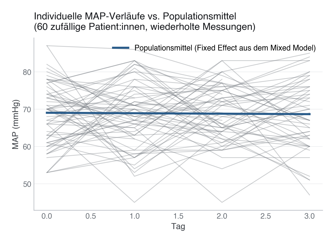
Erzeugt von fig_spaghetti() in module/18-longitudinal-mixed-models/code/figures.py, Zeile 31–51.
Python
Python-Code: in eine Datei mit Endung
.py schreiben und mit dem ▶-Knopf in VS Code ausführen – oder Zeile für Zeile in die Python-Konsole. Setzt die in Modul 02 eingerichtete Umgebung voraus.def fig_spaghetti(data: pd.DataFrame, mixed) -> None: """Per-patient MAP trajectories vs. the population-average (fixed-effect) trend.""" rng = np.random.default_rng(SEED) sample_ids = rng.choice(data["patient_id"].unique(), size=60, replace=False) fig, ax = plt.subplots(figsize=(7.5, 4.5)) for pid in sample_ids: sub = data[data["patient_id"] == pid].sort_values("tag") ax.plot(sub["tag"], sub["map_mmhg"], color=SECONDARY, alpha=0.35, lw=1.1) tag_range = np.arange(data["tag"].min(), data["tag"].max() + 1) pop_line = mixed.params["Intercept"] + mixed.params["tag"] * tag_range ax.plot(tag_range, pop_line, color=PRIMARY, lw=3, label="Populationsmittel (Fixed Effect aus dem Mixed Model)") ax.set_xlabel("Tag") ax.set_ylabel("MAP (mmHg)") ax.set_title("Individuelle MAP-Verläufe vs. Populationsmittel\n" "(60 zufällige Patient:innen, wiederholte Messungen)") ax.legend(loc="upper right") save(fig, ASSETS / "spaghetti_map.png")