25 · Bewertung der Modellgüte und klinische Validierung
roc_vs_pr_curve.png
Abbildung · Quellcode
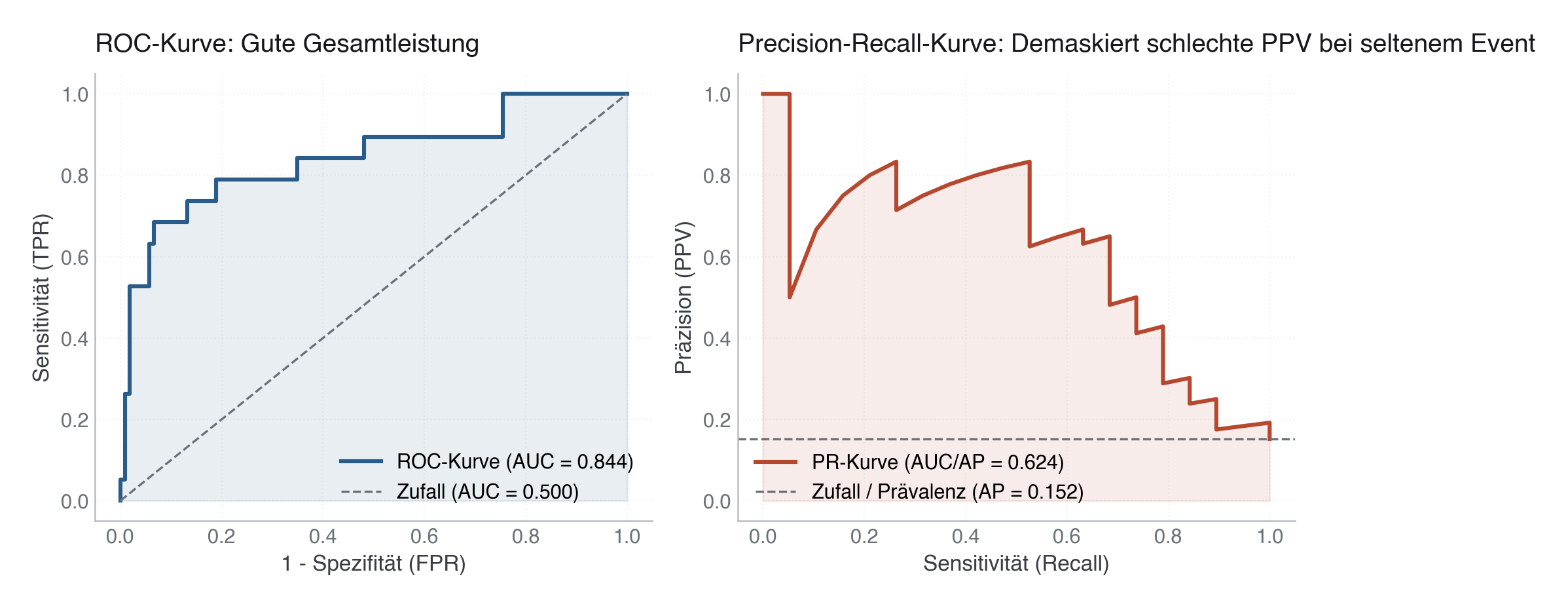
Erzeugt von fig_roc_vs_pr_curve() in module/25-modellguete-validierung/code/figures.py, Zeile 102–135.
Python
Python-Code: in eine Datei mit Endung
.py schreiben und mit dem ▶-Knopf in VS Code ausführen – oder Zeile für Zeile in die Python-Konsole. Setzt die in Modul 02 eingerichtete Umgebung voraus.def fig_roc_vs_pr_curve(y_test, proba) -> None: from sklearn.metrics import roc_curve, roc_auc_score, precision_recall_curve, average_precision_score fpr, tpr, _ = roc_curve(y_test, proba) roc_auc = roc_auc_score(y_test, proba) precision, recall, _ = precision_recall_curve(y_test, proba) pr_auc = average_precision_score(y_test, proba) fig, (ax1, ax2) = plt.subplots(1, 2, figsize=(10, 4.5)) # ROC Curve ax1.plot(fpr, tpr, color=PRIMARY, lw=2.2, label=f"ROC-Kurve (AUC = {roc_auc:.3f})") ax1.plot([0, 1], [0, 1], color=SECONDARY, lw=1.2, ls="--", label="Zufall (AUC = 0.500)") ax1.fill_between(fpr, tpr, alpha=0.10, color=PRIMARY) ax1.set_xlabel("1 - Spezifität (FPR)") ax1.set_ylabel("Sensitivität (TPR)") ax1.set_title("ROC-Kurve: Gute Gesamtleistung") ax1.legend(loc="lower right") ax1.grid(True, linestyle=":", alpha=0.6) # PR Curve ax2.plot(recall, precision, color=EVENT, lw=2.2, label=f"PR-Kurve (AUC/AP = {pr_auc:.3f})") base_rate = float(np.mean(y_test)) ax2.axhline(base_rate, color=SECONDARY, lw=1.2, ls="--", label=f"Zufall / Prävalenz (AP = {base_rate:.3f})") ax2.fill_between(recall, precision, alpha=0.10, color=EVENT) ax2.set_xlabel("Sensitivität (Recall)") ax2.set_ylabel("Präzision (PPV)") ax2.set_title("Precision-Recall-Kurve: Demaskiert schlechte PPV bei seltenem Event") ax2.legend(loc="lower left") ax2.grid(True, linestyle=":", alpha=0.6) plt.tight_layout() save(fig, ASSETS / "roc_vs_pr_curve.png")